Colors play a crucial role in our lives, influencing our emotions and behavior in many ways. In commercial interior design, the psychology of color is an essential consideration as it can have a significant impact on how people perceive and interact with a space. From stimulating productivity to creating a sense of calm, different colors can convey different moods and feelings. Understanding the psychology of color is essential for creating a successful commercial space. In this article, we will explore the psychology of color and its application in commercial interior design.
Understanding Color Psychology
Color psychology refers to the study of how colors can influence human emotions, thoughts, and behavior. Understanding how color affects people is essential for marketers, designers, and anyone who wants to communicate effectively with others. Here are some key points to keep in mind:
- Red: Red is a bold and passionate color that evokes emotions such as love, excitement, and anger. It can stimulate appetite and increase heart rate, making it a popular choice for restaurants and food packaging.
- Orange: Orange is a warm and cheerful color that is associated with happiness, optimism, and energy. It is often used to create a sense of playfulness and youthfulness.
- Yellow: Yellow is a bright and sunny color that represents joy, intellect, and creativity. It can be attention-grabbing and is often used to draw people’s attention to something.
- Green: Green is a calming and refreshing color that is associated with nature, growth, and balance. It can evoke feelings of relaxation and stability, making it a popular choice for health and wellness products.
- Blue: Blue is a cool and calming color that is often associated with trust, wisdom, and intelligence. It is commonly used in corporate branding to convey a sense of professionalism and competence.
- Purple: Purple is a royal and mysterious color that represents creativity, luxury, and spirituality. It is often used in marketing to target a more sophisticated audience.
- Pink: Pink is a gentle and feminine color that is associated with love, romance, and empathy. It can evoke feelings of nurturing and compassion, making it a popular choice for products aimed at women and children.

Applying Color Psychology in Commercial Interior Design
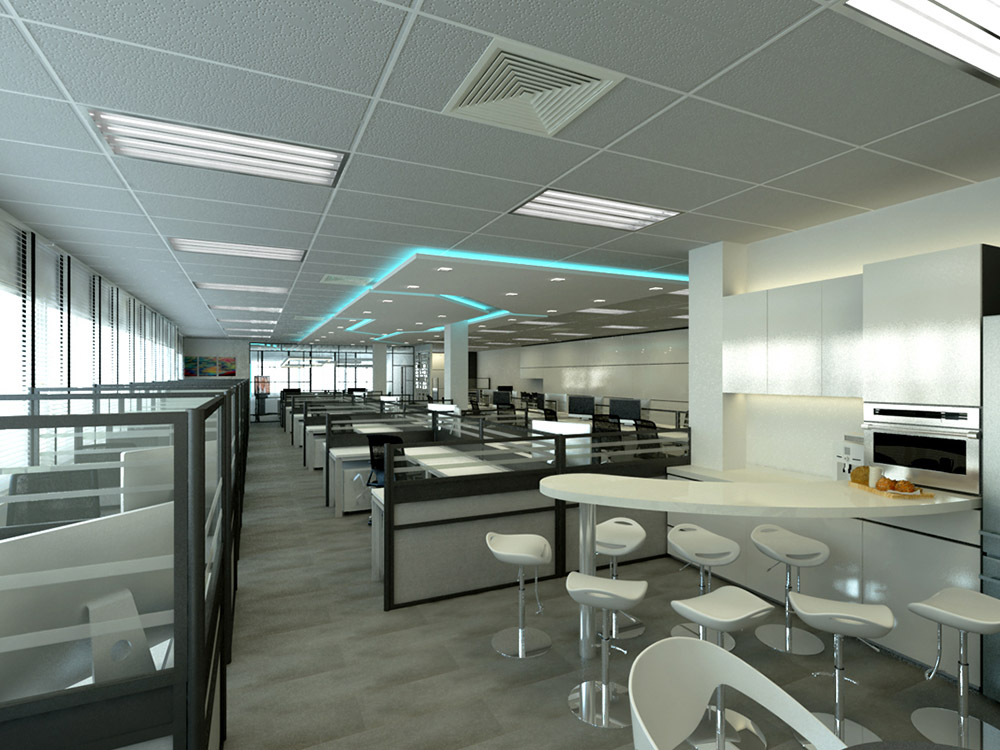
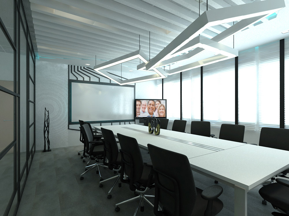
Commercial interior design is the art of designing and decorating public spaces, such as offices, restaurants, and hotels. Applying color psychology in commercial interior design is essential to create a space that not only looks aesthetically pleasing but also meets the functional and emotional needs of the occupants. Here are some key considerations to keep in mind:
- Purpose and function: The purpose and function of the space should be considered when selecting colors. For example, a restaurant may want to use warm and inviting colors to create a cozy and comfortable atmosphere, while a hospital may want to use cool and calming colors to promote healing and relaxation.
- Mood and emotion: Different colors can evoke different moods and emotions in a commercial space. For example:
- Red: Red can be used to create a sense of urgency and excitement, making it a popular choice for restaurants and retail spaces.
- Blue: Blue can create a calming and relaxing atmosphere, making it a popular choice for healthcare facilities and offices.
- Green: Green can evoke feelings of balance and harmony, making it a popular choice for spas and wellness centers.
- Yellow: Yellow can create a sense of optimism and energy, making it a popular choice for creative and playful spaces.
- Purple: Purple can create a sense of luxury and sophistication, making it a popular choice for high-end retail spaces and hotels.
- Branding: The colors used in a commercial space should also reflect the branding and values of the business. For example, a tech company may want to use sleek and modern colors to reflect its innovative and forward-thinking brand.
- Lighting: Lighting can also affect how colors are perceived in a commercial space. It is important to consider the type and intensity of lighting used when selecting colors.
Color Schemes in Commercial Interior Design
Color schemes are an essential aspect of commercial interior design that can help create a cohesive and visually appealing space. There are several types of color schemes that designers can use to create a particular look and feel. Here are some key types of color schemes:
- Monochromatic: A monochromatic color scheme uses different shades and tints of a single color to create a harmonious and cohesive look. This scheme is often used in minimalistic and modern designs.
- Complementary: A complementary color scheme uses colors that are opposite each other on the color wheel to create a dynamic and eye-catching look. This scheme is often used in high-contrast designs.
- Analogous: An analogous color scheme uses colors that are adjacent to each other on the color wheel to create a harmonious and natural look. This scheme is often used in nature-inspired and soothing designs.
- Triadic: A triadic color scheme uses three colors that are equally spaced on the color wheel to create a balanced and vibrant look. This scheme is often used in playful and energetic designs.
When choosing a color scheme for a commercial space, it is essential to consider the brand image and purpose of the space. Here are some key factors to keep in mind:
- Branding: The colors used in a commercial space should reflect the branding and values of the business. For example, a tech company may want to use sleek and modern colors to reflect its innovative and forward-thinking brand.
- Function: The function of the space should also be considered when selecting a color scheme. For example, a healthcare facility may want to use calming colors to promote healing and relaxation.
- Audience: The target audience of the business should also be considered. For example, a children’s playroom may want to use bright and playful colors to appeal to young children.
- Lighting: Lighting can also affect how colors are perceived in a commercial space. It is important to consider the type and intensity of lighting used when selecting a color scheme.
Color Trends in Commercial Interior Design
Color trends play an essential role in commercial interior design, as they can help create a modern and up-to-date look. However, it is also important to ensure that the design remains timeless and does not become outdated quickly. Here are some key considerations when incorporating current color trends into commercial interior design:
- Current color trends: Some current color trends in commercial interior design include:
- Earth tones: Natural and earthy colors, such as beige, brown, and olive green, are becoming increasingly popular, as they evoke feelings of warmth and coziness.
- Bold colors: Bold and saturated colors, such as deep blue and forest green, are also on-trend, as they create a sense of drama and sophistication.
- Pastels: Soft and muted pastels, such as blush pink and baby blue, are a popular choice for creating a calming and soothing atmosphere.
- Balance trendy and timeless: To ensure that the design remains timeless, it is important to balance trendy colors with neutral and timeless colors, such as white, gray, and black. This can be achieved by using trendy colors as accents or in small doses, while incorporating neutral colors in larger areas.
- Consider the purpose and function of the space: The purpose and function of the space should also be considered when incorporating color trends. For example, a trendy color scheme that works well for a retail space may not be appropriate for a healthcare facility.
- Consult with experts: Working with experts, such as interior designers and color consultants, can help ensure that the color trends are incorporated in a way that is both on-trend and timeless.
Case Studies/Examples
Case studies and examples can provide valuable insights into how color psychology can be effectively utilized in commercial interior design. Here are some key features to consider when analyzing successful commercial spaces:
- Branding: The use of color can help reinforce the branding of a business. For example, the Apple store’s use of white and minimalistic design reinforces the company’s innovative and forward-thinking brand.
- Function: The use of color can also contribute to the function of the space. For example, the use of warm and calming colors in a healthcare facility can help promote healing and relaxation.
- Mood: The use of color can also create a particular mood or atmosphere in a commercial space. For example, the use of bright and playful colors in a children’s playroom can create a fun and energetic atmosphere.
Here are some examples of successful commercial spaces that effectively utilize color psychology:
- Starbucks: Starbucks uses a warm color palette of green and brown to create a cozy and inviting atmosphere that encourages customers to stay and relax.
- Nike: Nike’s flagship store in New York City uses a monochromatic color scheme of black and white to create a sleek and modern atmosphere that reinforces the brand’s image as an innovative and cutting-edge company.
- The Wing: The Wing, a women’s co-working space, uses a pastel color palette of blush pink, mint green, and baby blue to create a feminine and welcoming atmosphere that appeals to its target audience.
- Whole Foods: Whole Foods uses a color-coded system to organize its store, with each department assigned a specific color. This not only makes it easy for customers to navigate the store but also reinforces the company’s values of health and sustainability.
What we have learnt
Color is a crucial element in commercial interior design, as it has the ability to evoke emotions and influence behavior. By understanding the psychology of color, designers can use it strategically to create the desired atmosphere and enhance the user experience. When choosing colors for commercial spaces, it is important to consider the brand identity, target audience, and the intended function of the space. By doing so, designers can create a harmonious and engaging environment that meets the needs and expectations of the users. The psychology of color is a fascinating and complex topic that continues to inspire designers to push the boundaries of creativity and innovation in commercial interior design.

Renovate with Todzterior!
We’re here to help you get started with Smart Home solutions.
Todzterior is the only company whose mission is to make homes “Smart.” In other words, our Smart Home solutions are built to help make your life easier. The possibilities for the future of the smart home are endless. You’ve come to the right place. We’re here to help you get started with Smart Home solutions and ensure you with smart quality and reliability.
Don’t hesitate to find out more about us. Call us here or visit our showroom at 7 Gambas Crescent #01-03 Ark@Gambas Singapore 757087.
Frequently asked Question
1) How does color affect the mood of a commercial space?
A: Color can significantly impact the mood and emotions of people in a commercial space. Warm colors like red, orange, and yellow can create a sense of energy and excitement, while cool colors like blue and green can produce a calming effect.
2) Can color influence customer behavior in a commercial space?
A: Yes, color can affect customer behavior in a commercial space. For example, studies have shown that warm colors like red and orange can stimulate appetite, making them ideal for use in restaurants and cafes.
3) How do you choose the right color palette for a commercial space?
A: When selecting a color palette for a commercial space, consider the type of business and the emotions you want to convey. For example, a spa may opt for cool, calming colors like blue and green, while a tech startup may prefer bright, energetic colors like orange and yellow.
4) What are some common color schemes used in commercial interior design?
A: Some common color schemes used in commercial interior design include monochromatic, complementary, and analogous. Monochromatic color schemes use variations of the same color, while complementary schemes use colors that are opposite each other on the color wheel. Analogous schemes use colors that are adjacent to each other on the wheel.
5) Can the color of a commercial space impact employee productivity?
A: Yes, the color of a commercial space can affect employee productivity. Studies have shown that cool colors like blue and green can enhance focus and productivity, while warm colors like red and orange can decrease productivity and increase anxiety.
